Why No One Else Built This: The Product-Design Gap in Fintech
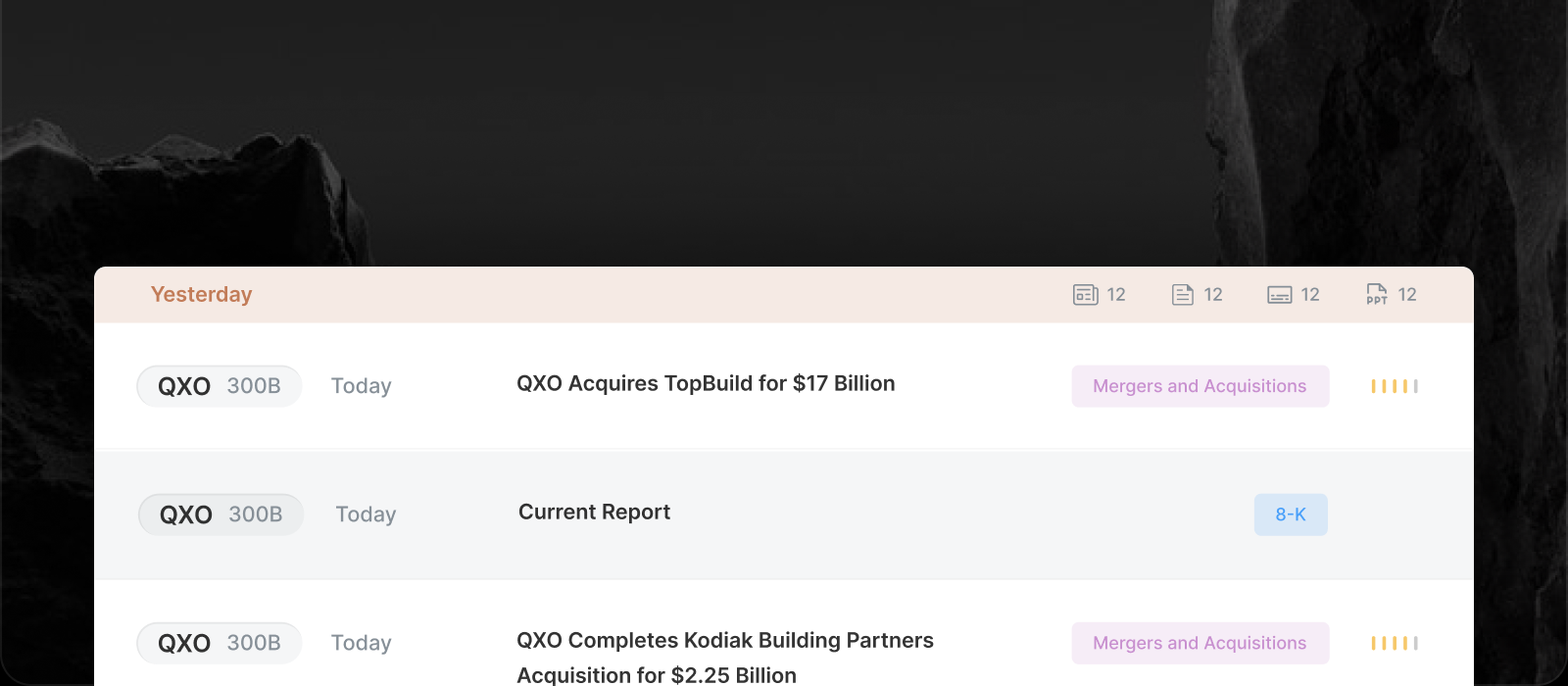

Open a few financial research platforms and a pattern shows up. The data is current and often impressive, yet the software around it can feel like it belongs to an earlier era.
This is an opinion piece, not a survey. But we have thought about the pattern a lot, and we think it explains most of what we do differently.
The product-design gap in financial software
Many of the strongest platforms in this space are genuinely excellent at data. Platforms like Fiscal.ai put the data first, and we respect that.
What is less common is the second half of the job: deciding what a person should see first, what can wait, and how it should feel to move around. That is product design, and in financial data it has often arrived late or not at all.
Why it happens: the data takes everything first
Financial data is hard. Getting the definitions, periods, restatements and filings right takes a long time, and an engineering team has to learn the vocabulary before it can build the data layer correctly.
By the time the data exists and works, the company has spent its energy there. The interface becomes the thing wrapped around the database.
Designers rarely get pulled in
Designers face the same terminology barrier. Finance is a field with its own language, and it is not an obvious place for a designer to start a career.
So the people who would most improve the experience are often not in the room. Few of them have worked on financial products, and few teams know to look for them.
Requests, not user flows
Teams led by finance experts tend to think in terms of capabilities. We need a screener, we need a new ratio, add a button here.
Those are sensible requests, and each one is easy to hand to a developer. What none of them addresses is the path a person takes from a question to an answer.
The result is software that grows by accumulation. Every feature works, and the whole is hard to learn.
People don't ask for what they haven't seen
There is an old product idea that people do not know what they want until you show it to them. It fits this category well.
Nobody asks for progressive disclosure, a news feed you can read at a glance or a chat assistant that already knows the filing on screen. They ask for more data. Then they see a version that is calm, fast and built on original sources, and the old way looks heavy.
What we did about it
We started from the person, not the database. Insighthread keeps terminal-level depth, such as full financial statements and insider conviction scoring, but opens everything in summary first and expands only when you ask. Usability researchers at Nielsen Norman Group call this progressive disclosure: show the few things most people need, and move the rest one step away.
The news feed leads with the ticker, market cap, category and an impact signal, so you can scan it. The AI analyst knows what you have open. A document opens on top of where you were, and closing it returns you to the same spot.
Under that sits a deliberate sourcing choice: everything comes from SEC filings, which we explain in why Insighthread only reads SEC filings.
The root of the other things we write about
This gap is behind most of our other principles. If you start with how the product should feel, you end up making different choices about who pays for it, what it should and should not show, and how much of the original source to put in front of you.
We might be wrong about parts of this. The best way to check is to try it, with a 7-day free trial and no credit card. The pricing page has the plans.