Design as Trust: Why How a Financial Product Looks Is Not Cosmetic
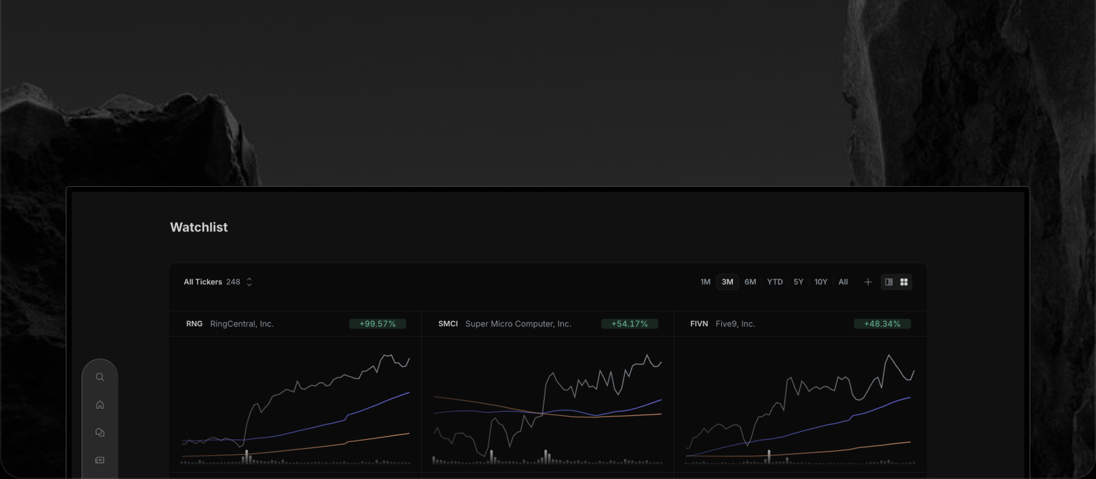

Open enough financial websites and a pattern appears.
Tickers scroll, panels stack, badges multiply, and the page looks busy in a way that feels expensive.
Somewhere along the way, density became a stand-in for credibility.
Why Cluttered Financial Interfaces Feel Credible
It is easy to see why.
Professional terminals are dense, so dense looks professional.
A screen packed with numbers suggests that someone, somewhere, knows what all of them mean.
That instinct is understandable, but it is a heuristic, and heuristics can be gamed.
When Density Becomes Camouflage
The financial data market is crowded with sources of very different quality.
Some data comes straight from regulatory filings, and some comes from rewrites of rewrites.
A busy interface makes those differences harder to see, because the reader cannot tell what is a filing, what is commentary and what is a headline repackaged from somewhere else.
Clutter is not proof of bad sourcing, but it is a very good place to hide it.
Legible Design Is a Sourcing Signal
Insighthread takes the opposite bet.
Every news item, filing, transcript and financial figure comes from SEC filings, with no third-party media in the mix.
Each news article carries a Sources section that points to the filing it was generated from, and the filing itself opens in a viewer.
A product that is this plain about where things come from has a reason to be plain about how it is laid out.
We explain the sourcing side in Why Insighthread Only Reads SEC Filings.
How Insighthread's Layout Shows You Where Data Comes From
The structure of the app is itself a statement about provenance.
A company profile separates Financials, IR, Forecast and News into their own places, so you always know whether you are looking at a reported number, a primary document or a forecast.
Filings are shown as the filed document, not a paraphrase.
Feed rows carry a badge for what they are: a news category, a form type such as Form 4 or 8-K, an earnings call or a presentation.
You can tell what kind of thing you are looking at before you read a word of it.
Why Clear Design Matters More for Retail Investors
Professionals can compensate for a confusing interface with years of habit.
Everyone else cannot.
When the person reading is deciding where to put their own money, the cost of misunderstanding what a screen is telling them is real.
Clarity is a form of respect for that reader, and it is also the quickest way for them to check our work.
Judge Financial Software by What It Lets You Verify
Next time a financial product looks impressive, ask a different question.
Can I tell where each piece of information came from?
Can I get from a claim to the primary document in one step?
If the interface makes that easy, the design is doing honest work.
The same test applies to AI answers. Insighthread's AI chat opens with the filing or transcript you are reading attached, so an answer can be checked against the document it came from.
If you would like to see how we answer, start with The Design Philosophy Behind Insighthread or open the app and click through to a source yourself.
Pricing is $30 a month or $300 a year, with a 7-day free trial, on the pricing page.